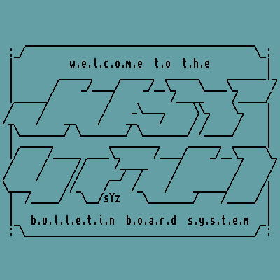
With the recent launch of ASCII arena the Amiga ASCII scene seems to have had a little boost, resulting in some nice new work being released. Initiated by Uprough and Divine Stylers, both old Amiga collectives. Designed with the look and feel of the classic Amiga (using DMG’s great Amiga fonts) it really is a nice experience browsing their growing database and online community.
Amiga ASCII has a rich history since the 1990’s. It originated from the BBS’s where ASCII had a natural place in the text-interface, being low in file size and download time. Eventually the artists started publishing ‘collies’ (collections) separately. Being long text files with logos intermingled with lyrics, drawings and other stuff. This evolved into a once quite large scene, consisting of more than 750 individual in about 300 groups. Resulting in about 6000 ‘collies’ over the years, peeking in the mid 90’s and nearly dried up after 2002. Since 2002 there’ve only been a handful of collies released, perhaps around 5 to 10 per year.
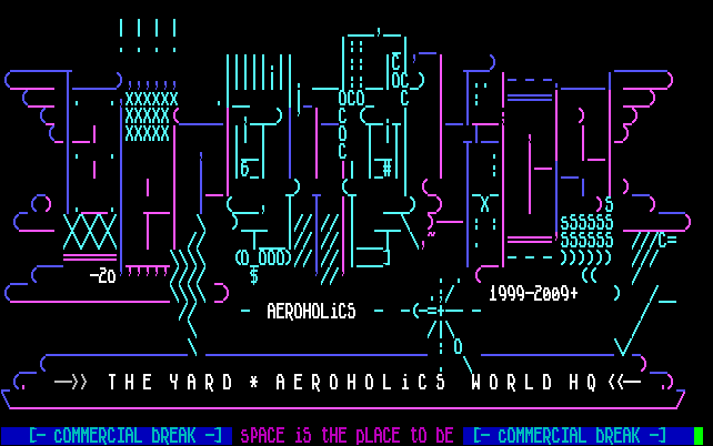
Amiga ASCII is famous for their special style, which differs mostly in the focus on (logo) outlines by special usage of dashes and underscores, based on the Amiga’s characteristic font. The PC ASCII / ANSI scene focused more on (often gradient) fills and the use of ANSI block characters to create larger filled objects and big chunky pixel style logos and designs similar to regular pixel drawing, but instead building a bigger picture based on the percentage of filling of a character, this is different to the regular and traditional Amiga ASCII approach.
It should be noted that the difference as described is not as strict as it may appear at first, yet generally speaking their approaches are strongly connected to their scenes.
Here’re some examples of Amiga ASCII throughout the years.
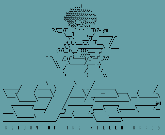
Excerpt of ASCII art by Mortimer Twang of House of Style .

Excerpt of ASCII art by Zaphod of cAUSTIC sTYLE.


Excerpts of ASCII art by Stylez of Artcore.
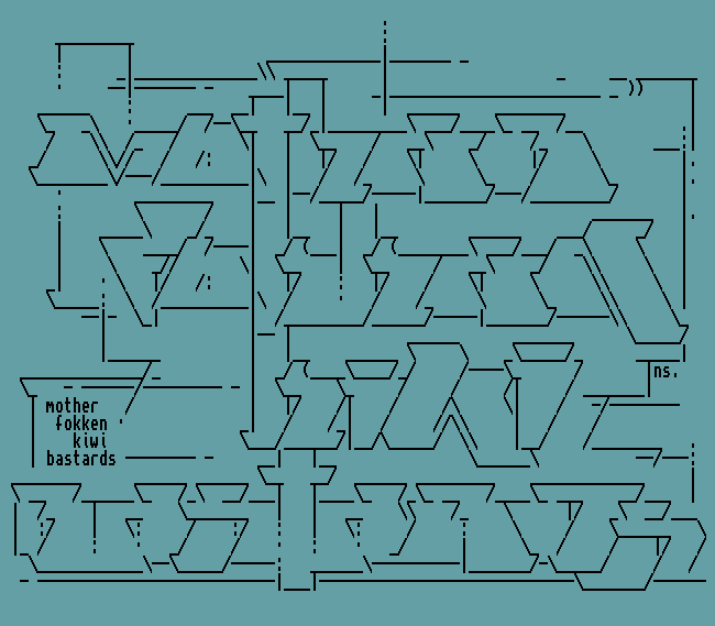
Excerpt of ASCII art by Ansichrist of Aerosol & Remorse 1981.
ASCII may be regarded as a abandoned domain, with few signs of strong life continuation, the art itself is not forgotten. Often referred to in different types of media as an element of style, it can also be found in the work of artists like Delaware (See their work and read their interview here). Delaware does not restrict or adapt themselves to the ASCII subculture, but it surfaces in their work as part of their visual vocabulary.

Every now and then new ASCII (related) work appears, notable the TMDC (text mode demo contest) is an annual competition mostly participated by members of the demoscene. The competition dates back as far as 1996. Their technique applied is defining their own font, using them for visual (often mathematical) effects.
That technique comes quite close to the project ASCIImeo by Peter Nitsch. A realtime ASCII filter for videos, a good example of how the ASCII still surfaces today’s media. This implementation is comparable to the automated process of TMDC, as it’s a way of rendering data visually, but not to the manual craft of Amiga ASCII. Here’s a nice example of ASCIImeo (via todayandtommorow.net).
TMDC is similar to John Whitney’s famous art piece Matrix III which was made available by Skuzzyanimation on Youtube (via Rhizome) in technique.
If you want to see a proper seminar on ASCII history, checking RaD Man’s seminar is most informative – even though some might argue there are some misconceptions here and there. Then again, ASCII is relatively young – and these are the first historic documents, mistakes are inevitable.
_
 [Ne7]
[Ne7]
Here are a few wicked n cool older Amiga ASCII artists you should check out to give you a flavour (no order):
Shapechanger, Nup, H2o, Mogue, Rotox, Sal-one, Green Eyed Monster, Amblin, Sk!n, Darkus, Devistator, Tango, 2fast, Zeus, Chrombacher, Countzero.
_
Special thanks to Ne7 and Dipswitch for their help!
![]()
Nice post! The original (non-ASCII) Whitney work is here: http://www.youtube.com/watch?v=ZrKgyY5aDvA
And here’s an old post I made about text art: http://chipflip.wordpress.com/2008/02/25/text-art
Nice. Sorry I was busy when you asked about proofreading, but you really didn’t need it (:
http://sixteencolors.net/ you know this already ?
It would be nice if, you know, when you indicated there were some misconceptions in the speech, you listed them so the world could improve, instead of just implying it, and dropping the link.
Yes, really nice post. I like very much ASCII art. Thx a lot